The existence of new image formats that offer better quality at smaller file sizes is not a new occurrence. WebP has been around for around a decade, AVIFs are becoming more widely supported, and now JPEG XL is here; continuing to only offer JPEG and PNG images is missing out on some serious file size savings.
Basic steps to offer up multiple formats #
Adding support for multiple image types is relatively straightforward, you need your images to be in multiple formats, and you need to list all of those out in your HTML for the browser to choose from. For the first part, creating multiple versions of your images, you can use a site like Squoosh to create alternate versions or you can use command line tools like cwebp (for converting to WebP) and go-avif (for AVIF). Then, if you have these image files available, the <picture> element allows you to provide them all to the browser.
<picture>
    <source srcset="/images/beer/shanghai/BoxingCat_Outside_Logo.avif" type="image/avif">
    <source srcset="/images/beer/shanghai/BoxingCat_Outside_Logo.webp" type="image/webp">
    <img src="/images/beer/shanghai/BoxingCat_Outside_Logo.jpg" alt="Boxing Cat logo showing their mascot who looks like a skinny Thai boxer" loading="lazy" decoding="async" width="1200" height="900">
</picture>
In the markup above, I’m providing 3 versions of the same file. By putting the AVIF file first, I’m telling the browser the preferred format to use, if supported. WebP is next, and then finally the <img> tag in there is both a fallback for browsers that don’t support the <picture> element or can’t decode WebP or AVIF files. If I was going to add in a JPEGXL image, I could have another <source> element in the list.
Extending images in markdown #
Now, all of that seems fairly clear, and if I was just working with a single HTML page and a few images, it wouldn’t be hard to accomplish, but I want to update how images are being rendered on my entire blog. For my site, I’m using Hugo, which means my posts are written in markdown, and an image is specified like this:

By default, this will turn into:
<img src="/path/to/the/image.jpg" alt="alt text">
But what I want is the <picture> markup shown earlier, with <source> lines added when the alternative image format is available. I’ve seen quite a few examples online where people use shortcodes and end up specifying their images like 
<img> and lets you jump in and change things. Using some great examples from Laura Kalbag and Alex Lakatos, I came up with this template for my images:
{{ if hasPrefix .Destination "http"  -}}
<img
    src="{{ .Destination | safeURL }}"
    alt="{{ .Text }}"
    loading="lazy"
    decoding="async" />
{{ else -}}
{{ $img := imageConfig (add "/static" (.Destination | safeURL)) }}
{{ if gt $img.Width 760 }}
<div class="lightbox">
    <a href="{{ .Destination | safeURL }}" data-caption="{{ .Text }}">{{ end }}
<picture>
    {{ $isJPG := eq (path.Ext .Destination) ".jpg" }}
    {{ $isPNG := eq (path.Ext .Destination) ".png" }}

    {{ if ($isJPG) -}}
      {{ $jxlPath:= replace .Destination ".jpg" ".jxl" }}
      {{ $jxlPathStatic:= printf "static/%s" $jxlPath }}

      {{ if (fileExists $jxlPathStatic) -}}
        <source srcset="{{ $jxlPath | safeURL }}" type="image/jxl" >
      {{- end }}
      {{ $avifPath:= replace .Destination ".jpg" ".avif" }}
      {{ $avifPathStatic:= printf "static/%s" $avifPath }}

      {{ if (fileExists $avifPathStatic) -}}
        <source srcset="{{ $avifPath | safeURL }}" type="image/avif" >
      {{- end }}

      {{ $webpPath:= replace .Destination ".jpg" ".webp" }}
      {{ $webpPathStatic:= printf "static/%s" $webpPath }}

      {{ if (fileExists $webpPathStatic) -}}
        <source srcset="{{ $webpPath | safeURL }}" type="image/webp" >
      {{- end }}
    {{- end }}

    {{ if ($isPNG) -}}
      {{ $jxlPath:= replace .Destination ".png" ".jxl" }}
      {{ $jxlPathStatic:= printf "static/%s" $jxlPath }}

      {{ if (fileExists $jxlPathStatic) -}}
        <source srcset="{{ $jxlPath | safeURL }}" type="image/jxl" >
      {{- end }}
      {{ $avifPath:= replace .Destination ".png" ".avif" }}
      {{ $avifPathStatic:= printf "static/%s" $avifPath }}

      {{ if (fileExists $avifPathStatic) -}}
        <source srcset="{{ $avifPath | safeURL }}" type="image/avif" >
      {{- end }}

      {{ $webpPath:= replace .Destination ".png" ".webp" }}
      {{ $webpPathStatic:= printf "static/%s" $webpPath }}

      {{ if (fileExists $webpPathStatic) -}}
        <source srcset="{{ $webpPath | safeURL }}" type="image/webp" >
      {{- end }}
    {{- end }}

    <img
      src="{{ .Destination | safeURL }}"
      alt="{{ .Text }}"
      loading="lazy"
      decoding="async"
      width="{{ $img.Width }}"
      height="{{ $img.Height }}"
    />
  </picture>
  {{ if gt $img.Width 760 }}</a></div>{{ end }}
{{end -}}
It’s a bit poorly structured and repeats the same logic twice, so I’ll probably go through and rewrite it soon, but the flow is basically this: Pull the info about the current image (including it’s height and width, which is handy), wrap the whole thing in some lightbox code if the image is larger than I’m going to render on the page, then check if there are JPEGXL, AVIF, or WebP versions and output the appropriate lines of a <picture> element. With that in place, I added .avif, .jxl, and .webp images for a couple of posts and did my testing.
Converting all my images to have multiple formats available #
Once I was happy with it all, I wrote a PowerShell script (I don’t do PowerShell, so this was done with the aid of a lot of visits to StackOverflow and the docs) to run through and generate AVIF and WebP versions of every PNG and JPG. I haven’t bothered making JPEGXL images yet because browser support is so limited at this time. In reality, most people will end up seeing the WebP, so that probably would have been sufficient.
# get current directory
$initpath = Get-Location
# get all directories
foreach($img in Get-Childitem $initpath -File -Recurse) {

    $extension = $img.Extension
    if ($extension -iin ".jpg",".png") {
        Write-Output "To be converted"

        Write-Output $img.FullName

        # output file will be written in the same directory
        # but with .webp extension instead of old extension
        $outputName = $img.DirectoryName + "\" + $img.BaseName + ".webp"
        $outputNameAVIF = $img.DirectoryName + "\" + $img.BaseName + ".avif"

        # since you have the cwebp bin folder in PATH just type the command
        # more options https://developers.google.com/speed/webp/docs/cwebp
        cwebp -q 75 -m 6 -af -f 50 -sharpness 0 -mt -v -progress $img.FullName -o $outputName
        $cmdLine = "avif-win-x64.exe -e `"" + $img.FullName + "`" -o `"" + $outputNameAVIF + "`""

        invoke-expression -command $cmdline
    }  else  {
        Write-Output "Not To be converted"
        Write-Output $img.FullName

    }
}
set-location $initpath
We could debate alternative ways to do this. I could do the conversion as part of my CI process, so that I didn’t have to have 3 versions of every image checked into my Git repo, or I could be using something like CloudFlare to do this dynamically. In keeping with my general credo of do as little work as possible, I liked the idea that the conversion would happen only when I added an image (it is a manual step though, that could be improved) and decided I don’t mind all those duplicate images in Git.
What was the end result? #
Once everything was done and pushed up to my repo, the CI job ran and published an updated version of my site. I ran some WebPageTest passes before and after to see the result, and while it isn’t a massive update, it had the expected result. Well, it actually had two expected results, because I am a terrible scientist and I really made two improvements with this change.
First, from the various bits of code I read to make my render template, I learned how to pick up the height and width for my images and add them to the HTML. This is great, because it helps avoid layout shift, and if we compare the old to the new in WebPage test you can see that change.
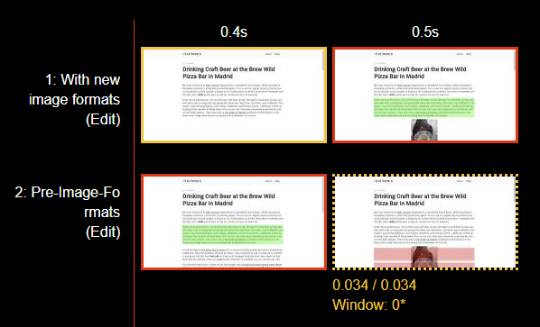
It is a small change, but my CLS for this particular post went from 0.035 to 0. Every little bit helps!
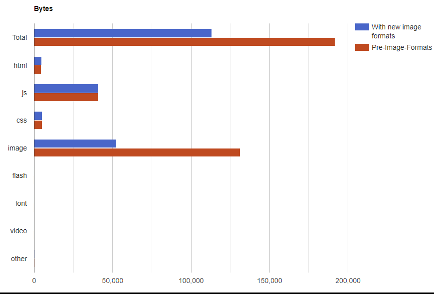
The second change, which was the initial goal can only be seen in the amount of bytes transferred. These images are small, so there isn’t a corresponding change to the overall performance, but saving bandwidth is important.
Next steps #
So, some work to do to tidy up my template code, but overall a nice little tweak to the site for a Sunday. The <picture> element can do more than just serve up different formats though, it can also provide different resolutions and pixel density versions, which could allow for even more bandwidth saving for mobile devices. Maybe next week’s project?