8 minutes
Assessing your site for Accessibility
A little while back I started a series around assessing your own site, geared towards site owners, especially those that may not be as deeply technical and yet still want to make sure they are building a quality experience. I hesitated to write this specific post, focusing on the accessibility of your site, because it is an exceedingly difficult topic. Accessibility covers many distinct aspects of the web experience and there is no fully automated way to ensure you are doing it correctly.
Having said that, I’m going to run through the four fundamental areas I would look at when assessing a site. This represents the minimum level of accessibility testing I expect on any web project, even if you are a small site or new at doing development. For a true assessment of your site’s accessibility, especially if you are a large company or your site is complex, you should have expert help to ensure you have created a compliant and usable experience for all your visitors.
First, the fundamentals #
This has come up when we talked about SEO as well, and I’ll mention it
again when we cover performance; your site should be constructed using
valid
HTML.
You can test your pages using a validator
service, but what a validator will not
test is if you are using the “right” HTML. What this means is that you
should be using HTML elements correctly. Your headings should be using
<h1>, <h2>, etc., your links should be <a> tags with href
attributes, if you have a button it should be a
<button>,
and so on. Try opening the dev tools in your browser, or viewing the
source of your page, and finding your main heading. Is it a <h1>?
Valid semantic HTML helps make your page accessible as a
start.
Beyond your markup, your site should work well at different screen widths and at different zoom levels. Testing a site at different widths is standard these days, to ensure it will work well on mobile devices, but anyone on a desktop device could be viewing your site at less than the full width of their screen. The zoom feature in browsers is tested less often but is also important. Depending on how your site is coded, zooming could affect only the text or everything on the page, so test at different widths and zoom levels. This guide from Yale University’s Web Accessibility department discusses both zooming and features in browsers that specifically adjust text size.
Then, take a look at your colors #
A common issue with web experiences is that the contrast between your text and its background, is too low. A low contrast makes it harder for the user to read the text and even if they can read it, the increased difficulty will reduce their enjoyment of going through the content. I took a screenshot from a local website shortly after it launched, because I could barely read the text and I knew it would come in handy as a future demo of color contrast. It has since been updated, which is great for any users of that site, but I was happy to have saved this image.
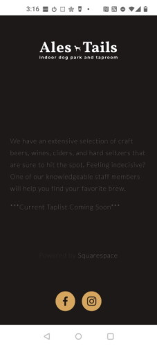
In the above image, the contrast is too low, but this is made worse by the size of text. To meet accessibility guidelines, body text should have a 4.5 to 1 contrast ratio while large text (like a headline) can have a ratio as low as 3 to 1. The text above is 3.51 to 1, but it is such small and thin text that it is extremely difficult to read.
Accessibility is a broad set of accommodations, with the goal of making your site usable by everyone. While we tend to think of these considerations as being most important to users with disabilities, it is important to realize that many more people can benefit from this work than you may expect. Good color contrast is important for someone with low vision but can also help if you are trying to read a device in bright sunlight. Captions on a video are essential for someone who cannot hear the audio but can also be a great aid to understanding the content for many people in many situations.
You may be able to spot significant issues with color contrast just by looking at your page, but this is one of the types of accessibility issues where some great tools exist to help you out. My go-to tool for checking a webpage is the Accessibility Insights extension for Chrome and Edge. With this tool installed, you can click on the extension icon and do a ‘fast pass’ test of a page. It will find color contrast issues, along with a variety of other type of accessibility issues and is a great first step.
Ideally, you’d be thinking about color contrast and all these other accessibility topics before you even have a page up. This can be part of your design for example, choosing what colors you intend to use across your site. To check two colors, a foreground and background, for contrast before you put them onto a webpage you can use a tool like Contrast Checker or Contrast Ratio from Lea Verou. If you are designing a simple page, you might decide that a white background with black text is the best choice, which certainly has enough contrast, but in reality, users will enjoy a pair of colors that are slightly closer together. The New York Times, for example, uses a dark gray (#333) on pure white for their text. The site “Contrast Rebellion” gives a lot of examples of good and bad contrast experiences.
Contrast is often an issue if you have placed text over an image, such as in a header on your page, and some automated tools will not be able to pick this up. The same rules apply, but the colors under your text could vary depending on the image is displayed or sized at different screen widths. To be safe, I would recommend avoiding putting text overtop of an image, as even with good contrast the background will be busier and making reading more difficult. Sometimes you have no choice though, or it is key to your design. In those situations, one approach is to create an overlay to darken the image and increase contrast with your text. Remember that larger text is more readable even with a lower contrast ratio, so a headline may work well over an image where smaller text would not. This comes up so often that there are multiple great articles on this topic:
- Optimal Overlay Finder For Readable Text on a Background Image – Bram.us
- Handling Text Over Images in CSS (ishadeed.com)
- Ensure High Contrast for Text Over Images (nngroup.com)
Try Keyboard Navigation #
Another great test is to see if you can navigate through all your content and access all the features of your site using only the keyboard. Experiences that only work on ‘hover’ are not going to be accessible for many people, but you may find many other areas of your page that are not reachable using the tab key on your keyboard. While you are doing this type of testing, consider how much work it is taking you to get through your page and whether you are always aware of your current position. Experienced screen reader and keyboard users have many shortcuts and navigation methods beyond just tabbing through, but this is still a straightforward way to test if it is at least possible to get to everything on the page without a mouse (or touch screen). Can you get to the navigation menu of your site? If it has drop-downs, can you open them without accidentally navigating to another page? The UC Berkeley site has a good guide to testing your site for keyboard access.
Ensure you have Alternative Text for Images #
Users with vision issues will be consuming your site through a screen reader and may not be able to see images well or at all. Users may also choose to turn off images to simplify a web site to make it easier to process. Regardless of the reason, it is important that your site is still usable with it’s images missing.
In HTML, we can supply “alt text” as an alternative representation of the image in words. This text is critical to understanding your content, assuming you have images with meaning as part of your pages and should be written with a goal of providing all the information you were trying to convey with the original photo or graphic. Automated accessibility tests will merely check for the existence of alt text and are unable to determine if that text is useful. Alt text of “Image” or “Screenshot” for example, is not really a replacement for the missing graphic. Writing good alt text is worth an article on its own.
It is also worthwhile to test your site with a screen reader, but in my experience that is difficult to do effectively. It takes time to learn how to navigate and test pages in the same way that a regular screen reader user would, but a quick guide to trying this out with NVDA is provided from the WebAIM site. A better and more accurate test of your site would be to enlist the help of a frequent screen reader user, someone who is comfortable with the various navigation methods and can evaluate the experience compared to other sites they find enjoyable to use.
Next steps and more tips #
As I mentioned at the start, this is a quick guide to the minimum set of accessibility areas you should be covering on any site, no matter how small or what purpose it is for. There are a lot more topics for you to consider including reducing or avoiding animations, writing proper link text, video captions / descriptive text, and designing for neurodiverse users. How far you go depends on your available time and resources, but even the steps in this guide should help make your content usable by more people.
Thoughts on this post? Feel free to reach out on Bluesky!
Web DevelopmentCodingAccessibilitySelf-Assessment
1685 Words
Published
47bafe5 @ 2023-10-17